
The inert Attribute: Stop Writing Focus Trap JavaScript

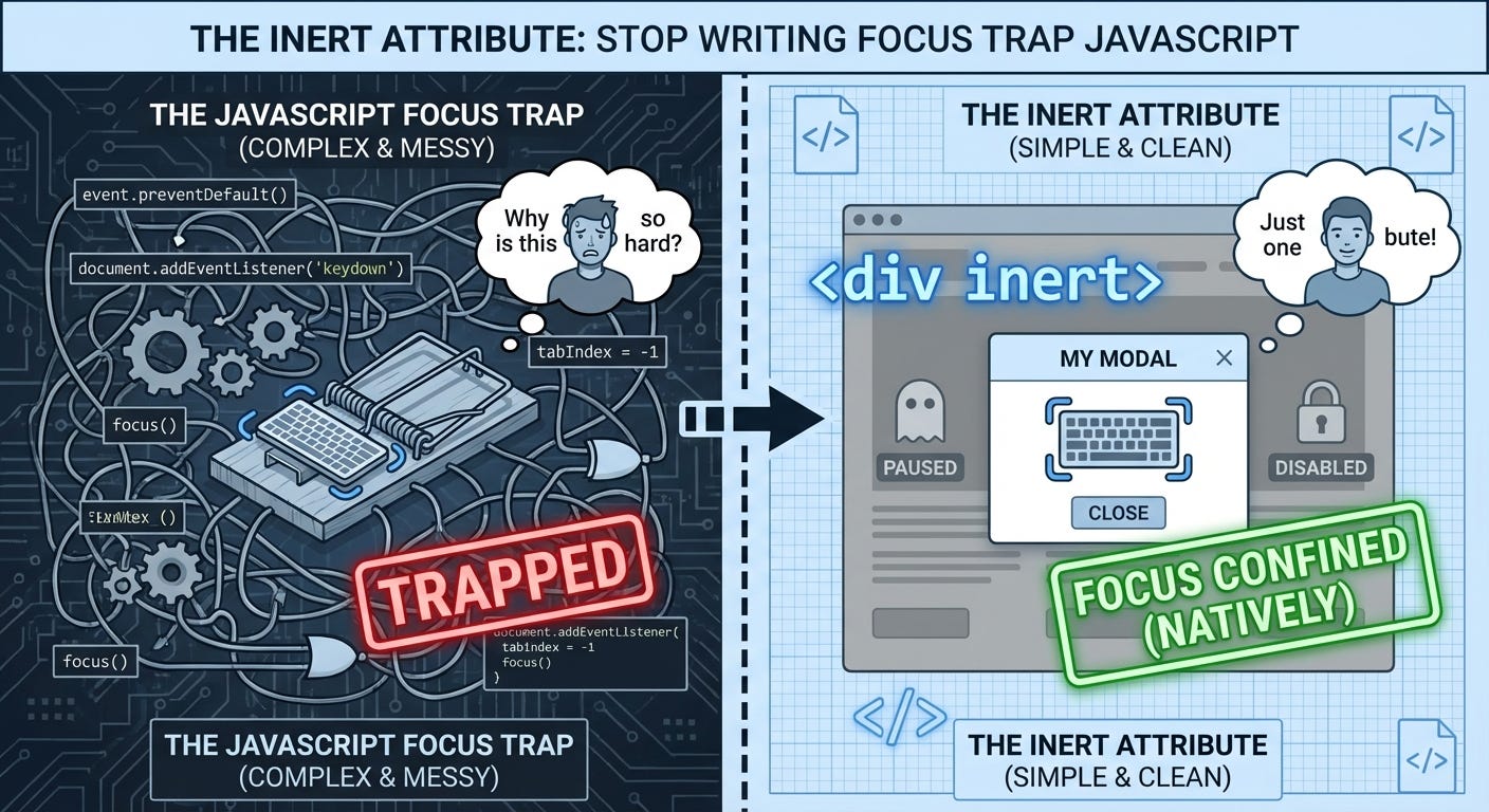
Every time you build a modal, you write the same JavaScript. Trap focus inside the dialog. Prevent tabbing to background content. Handle escape key. Make sure screen readers ignore the page behind the modal.
There’s a better way. It’s been in browsers since 2022. And almost nobody’s using it.
The Focus Trap Problem
Here’s what we’ve all written a hundred times:
// Modal opens
const modal = document.querySelector('.modal');
const focusableElements = modal.querySelectorAll(
  'button, [href], input, select, textarea, [tabindex]:not([tabindex="-1"])'
);
const firstElement = focusableElements[0];
const lastElement = focusableElements[focusableElements.length - 1];

modal.addEventListener('keydown', (e) => {
  if (e.key === 'Tab') {
    if (e.shiftKey && document.activeElement === firstElement) {
      e.preventDefault();
      lastElement.focus();
    } else if (!e.shiftKey && document.activeElement === lastElement) {
      e.preventDefault();
      firstElement.focus();
    }
  }
});
Or you install focus-trap, react-focus-lock, or some other library to do it for you.
This solves half the problem. Users can’t tab out of the modal. But they can still:
Click buttons behind the modal
Use screen readers to navigate to background content
Find-in-page can still match hidden text
Mouse users can still interact with covered elements
So you add aria-hidden="true" to the background. And pointer-events: none in CSS. And maybe some z-index juggling. And hope you didn’t miss anything.
There’s a better way.
Meet the inert Attribute
One attribute. Does everything:
<div class="page-content" inert>
  <!-- Everything in here becomes completely non-interactive -->
  <button>Can't click me</button>
  <a href="/somewhere">Can't navigate</a>
  <input type="text"> <!-- Can't focus or type -->
</div>

<div class="modal">
  <!-- This stays interactive -->
  <button>Actually works</button>
</div>
When an element has inert:
No clicks - Click events don’t fire
No focus - Can’t tab to it, can’t focus it
Screen readers ignore it - Removed from accessibility tree
Find-in-page skips it - Can’t search for text inside
Text selection disabled - Can’t select text
Descendants inherit it - Everything inside is also inert
It’s like the element doesn’t exist for interaction purposes. But it’s still visible.
Modal Dialogs Done Right
Here’s the pattern:
function openModal() {
  const modal = document.querySelector('.modal');
  const background = document.querySelector('.page-content');

  background.inert = true;  // That's it
  modal.hidden = false;
  modal.querySelector('button').focus();
}

function closeModal() {
  const modal = document.querySelector('.modal');
  const background = document.querySelector('.page-content');

  background.inert = false;
  modal.hidden = true;
}
No focus trapping code. No aria-hidden management. No pointer-events CSS. Just one property.
Everything works:
Tab stays inside the modal automatically
Screen readers only see the modal
Clicks on background do nothing
Escape key still works (handle that separately)
Find-in-page only searches the modal
Real-World Example: Sidebar Navigation
I use this for off-canvas navigation all the time:
<div class="app">
  <div class="sidebar">
    <nav>
      <a href="/home">Home</a>
      <a href="/about">About</a>
    </nav>
  </div>

  <main class="content">
    <h1>Main Content</h1>
    <button id="open-menu">Menu</button>
  </main>
</div>

<script>
  const sidebar = document.querySelector('.sidebar');
  const content = document.querySelector('.content');
  const menuBtn = document.getElementById('open-menu');

  menuBtn.addEventListener('click', () => {
    sidebar.hidden = false;
    content.inert = true;  // Disable main content
    sidebar.querySelector('a').focus();
  });

  // Close handler sets content.inert = false
</script>
When the sidebar opens, the main content becomes inert. Users can’t accidentally click a button behind the overlay. Screen readers don’t jump between sidebar and content. Tab order stays clean.
It’s Better Than aria-hidden
Here’s what I learned the hard way: aria-hidden="true" only affects screen readers.
<div aria-hidden="true">
  <button onclick="doSomething()">Click me</button>
</div>
Screen readers ignore this. But keyboard users can still tab to the button. Mouse users can still click it. It’s half a solution.
inert does what you actually wanted aria-hidden to do:
<div inert>
  <button onclick="doSomething()">Click me</button>
</div>
Nobody can interact with this. Screen readers, keyboards, mice - all blocked. Complete inertness.
Visual Styling (You Need This)
Important: inert doesn’t change how things look. The attribute itself has no visual effect.
You need to add styling:
[inert] {
  opacity: 0.5;
  pointer-events: none;
  user-select: none;
}

/* Or for modals, dim the background */
.page-content[inert] {
  filter: brightness(0.8) blur(2px);
  transition: filter 0.2s;
}
Without visual indication, users get confused. “Why isn’t this button working?” Make it obvious.
Carousels and Pagination
Another killer use case - paginated content where only the visible page should be interactive:
<div class="carousel">
  <div class="slide" inert>Slide 1</div>
  <div class="slide">Slide 2 (active, no inert)</div>
  <div class="slide" inert>Slide 3</div>
</div>
Off-screen slides are inert. Users can’t accidentally tab to a “Next” button on slide 3 when viewing slide 2. Screen readers don’t announce content from hidden slides.
I’ve seen too many carousels where you can tab through 50 slides while only seeing one. inert fixes this.
Progressive Enhancement
Browser support is excellent now:
Chrome 102+ (May 2022)
Edge 102+ (May 2022)
Safari 15.5+ (May 2022)
Firefox 112+ (April 2023)
For older browsers, there’s a polyfill:
<script src="https://cdn.jsdelivr.net/npm/wicg-inert@3/dist/inert.min.js"></script>But honestly? In 2026, you probably don’t need it. The browsers that don’t support inert are the same ones you’ve already stopped supporting.
The Gotchas
Modal dialogs created with
<dialog>.showModal()ignore inertness. They escape it. This is intentional - you want your dialog to work even if a parent is inert. But it can be surprising.No visual indication by default. You must add your own styling. This is the biggest accessibility concern. Make inert content obviously disabled.
Can’t be overridden by descendants. If a parent is inert, children can’t opt out. Setting
inert="false"on a child doesn’t work. The entire subtree is inert.Find-in-page doesn’t work. This is mostly good (you don’t want users finding text in hidden modals), but sometimes surprising. Be aware.
When NOT to Use inert
Individual form controls: Use disabled instead:
<!-- Don't do this -->
<input type="text" inert>

<!-- Do this -->
<input type="text" disabled>
The disabled attribute has proper styling, works with forms, and is semantically correct for controls.
Permanently hidden content: Use hidden or display: none:
<!-- Don't do this -->
<div inert style="display: none">Hidden content</div>

<!-- Do this -->
<div hidden>Hidden content</div>
inert is for temporarily disabled interactive content, not for hiding things.
My Take
I’ve shipped this in production for design systems, modals, sidebars, and carousels. It replaced hundreds of lines of focus trap JavaScript.
The cognitive load dropped. No more “did I handle all the edge cases?” No more debugging why screen readers are announcing the wrong thing. No more users accidentally clicking background buttons.
One attribute. Everything works.
The only downside is you need to remember to style it. inert without visual feedback is an accessibility failure. But that’s on you, not the API.
If you’re still writing focus trap code in 2026, stop. Use inert. It’s what the platform should have given us from day one.
Quick reference:
// Make something inert
element.inert = true;

// Remove inertness
element.inert = false;

// Check if something is inert
if (element.inert) { }
/* Style inert content */
[inert] {
opacity: 0.6;
pointer-events: none;
}Using inert in production? Hit reply and let me know how it’s working for you.